
Praktio
Needs Assessment User Research Usability Evaluation


Client Objective
Praktio provides interactive online training in the fundamentals of transactional law. It works off the principle of learning by doing, using realistic scenarios and case studies to great effect. Courses are very interactive and include audio lessons accompanied by animated infographics, game-like quizzes, role-playing and interacting with contracts on-screen.
Audience
- Law students.
- Junior attorneys at domestic law firms (based in the United States).
- Junior attorneys at international law firms.
Project Objective
Our main objective was to improve the overall experience of using Praktio by using extensive user research and needs assessment methods to provide recommendations to:
- address usability issues faced by its users.
- improve Praktio to better fulfill its users’ needs.
Interaction Map
We created a static representation of the Praktio platform, that depicted the possible actions and the pages/screens that those actions can lead to. The main goals of this exercise were to:
- Better understand the system in a thorough manner.
- Identify potential usability issues and system breakdowns.
Interviews, Personas and Scenarios
Our objective during this phase was to develop a detailed understanding of Praktio's target population to help us focus on their needs.
We started by conducting a client interview to find out what they were most concerned about, and what kind of feedback would be most valuable to them.
Next, we interviewed 5 current users (a mix of law students and junior associates) of Praktio. We uncovered common themes, such as:
- Frustration at the lack of control over video playback.
- Lack of usage of certain features of the system (e.g. 'Recent Achievements')
We created three personas that covered the key behavioural and demographic variables exhibited by our target audience, based on this interview data.
We also created scenarios for each of the personas to describe how they would use the system to accomplish a realistic goal.


Comparative Analysis
We conducted a Comparative Analysis to familiarise ourselves with products that fulfilled similar needs for people and develop a better sense of what features are expected from products in the interactive learning domain. We hoped to better understand:
- Users' expectations of similar products
- Where these products succeeded and failed
- Best practices and solutions to issues we discovered during our interviews
One of the major weaknesses of Praktio that we discovered during our analysis was the lack of control over video playback. All the competing products offered various tools and features aimed at providing the learner with more control over the delivery of the content.
Survey
We conducted a survey of Praktio's current and former users to learn more about their attitudes, behaviors and characteristics. These were the research questions that guided our design of the survey questionnaire:
- How satisfied are Praktio’s users with the current version of Praktio?
- How does weekly computer use affect users’ perceptions of Praktio’s usability?
- What features would improve users’ experiences with Praktio?
Some of our most telling findings were:
- Respondents were highly satisfied with the delivery of audio content and did not have a preference for multiple narrators to break the monotony. This was in direct contradiction to the results of the interviews in which multiple interviewees mentioned that the audio experience could use some improvement, and suggested employing multiple narrators.
- Respondents were highly dissatisfied with the control over video playback. This supported and confirmed our findings in the previous phases of our project. The respondents also indicated which features would be most helpful in this regard, drawing from their previous experience with video players: interactive navigation bars allowing them to 'seek' to a particular part of the video, and speeding up the video playback.
- Respondents seemed to agree that the content could be made more engaging. They had very useful suggestions for the same, including shorter videos, and even more visual accompaniment for the audio content.
Heuristic Evaluation
Each team member then conducted individual Heuristic Evaluations using Jakob Nielsen's 10 Usability Heuristics for User Interface Design, following which all the team members' observations were aggregated, discussed, and prioritized (taking into account our teams' personas and scenarios when considering the severity of the identified issues).
We found that Praktio did not score very badly with most of the heuristics, but did violate a few of them in several instances.
Here are a few of our findings:
The total duration/time remaining is not displayed for a video.
Heuristic Violated: Visibility of system status

Buttons and links are styled inconsistently, are not in accordance with standards.
Heuristic Violated: Consistency and standards

Links styled like the surrounding text.

Links styled as blue.
Usability Testing
At last, we arrived at the final phase of our project: Usability Testing. We created a set of tasks as well as pre- and post-test questionnaires to obtain information such as user behaviour, technical proficiency and their opinions about Praktio. We then arranged for the necessary equipment and ran a pilot test to weed out any technical/procedural issues.
Finally, we conducted 5 usability tests and analyzed the resulting data. We distilled our observations down to a set of key findings including:
- At times when text transcripts accompanied audio, all the participants were frustrated at having to wait for the audio to finish playing, even though they had finished reading the content.
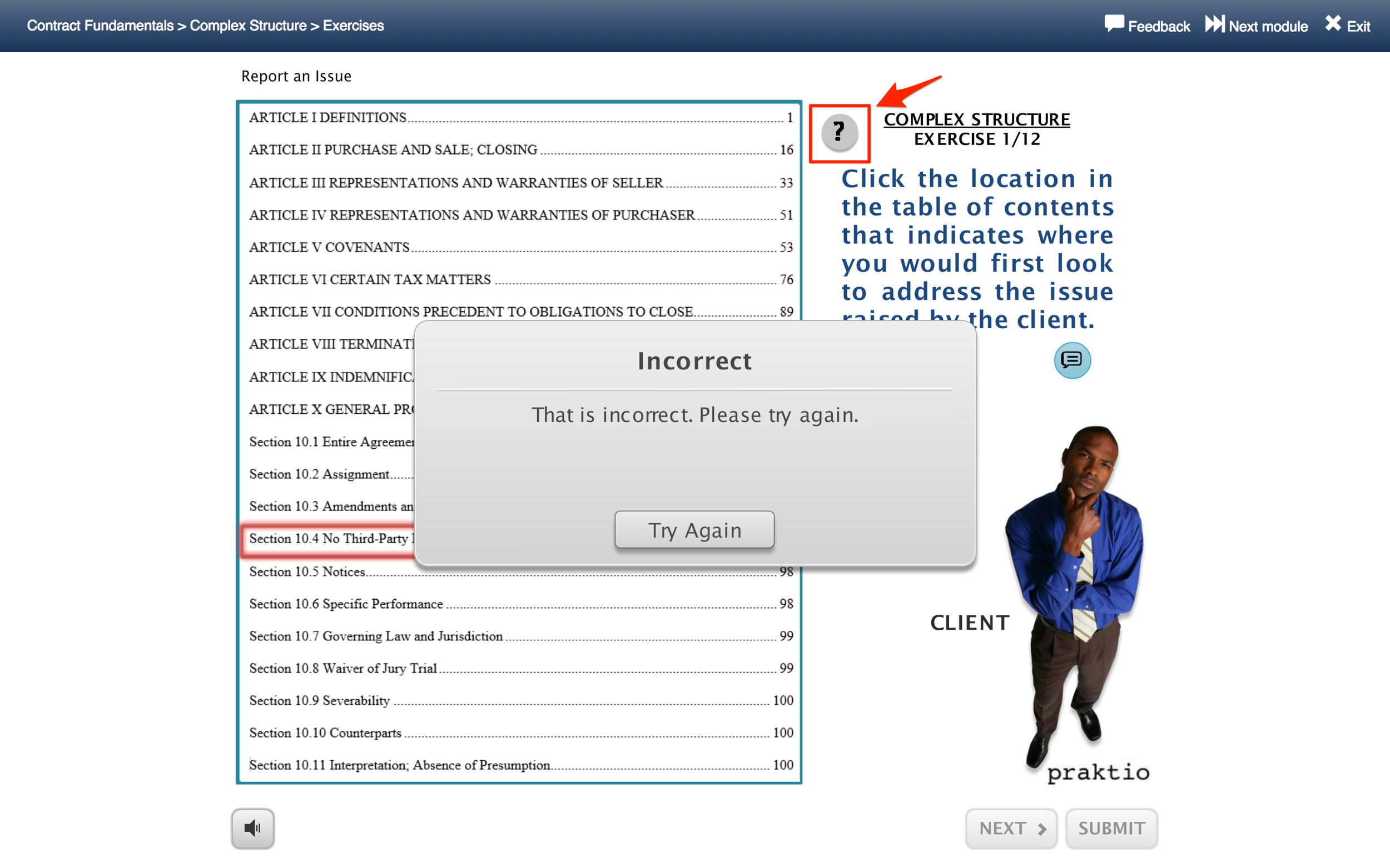
- In one of the exercises, people mistook the red box that appeared around their selection to mean that they had gotten the answer wrong (in reality, it was a highlight, meant to indicate which option they had selected), and were unsure of how to proceed after that.

- The ‘Review Primer’ button was rarely used, even when the participants required help.
Final Recommendations
While we made several recommendations after each phase of the project, the following were a few of the final recommendations after keeping the entirety of the evaluation in mind:
- There should be clearer feedback and indication of the fact that a learner has used up all their attempts at a quiz question, so that they know that the system will then move on to the next question.
Issue: Button does not indicate that the question is about to change since all the attempts have been used up.
Recommendation: Button clearly indicates that the question is about to change since all the attempts have been used up.
- Users should be provided with more control over video playback to reduce the time spent on listening to listening to parts of the video they've seen before.
Issue: In Praktio, the bar shown above does not allow a user to 'seek' to a desired point in the video.
Recommendation: In Coursera, the video navigation bar provides many features to enhance control over video playback, including an interactive 'seek' bar.
Lessons Learned
- Research study plans need to constantly be revised for various reasons (in particular because of the involvement of participants in research studies), and these revisions need to be promptly communicated to stakeholders.
- Not every phase of research will yield helpful insights, and that is simply part and parcel of user research.
- The best recommendations for redesign are achieved by consolidating and comparing the insights obtained from all phases of user research and usability assessment.